

Read Issue 18 of Works in Progress here. Samuel is an editor at Works in Progress. He focuses on urbanism and cities.
It is often said that Paris manifests the top-down vision of Napoleon III and Baron Haussmann, while London manifests centuries of piecemeal expansion and market forces. According to this story, the two cities can thus be seen as urbanistic metaphors for the statism of France and the liberalism of England.
The story is picturesque, but almost completely false. Neither Paris nor London was designed to an overall masterplan (in contrast to, say, New York or Berlin), and the vast majority of their streets were planned piecemeal by private developers. London may indeed be a metaphor for English liberalism, but Paris is no less a metaphor for that underrated thing, the liberalism of France.
In both cities, however, there are important exceptions to this pattern. It is widely known that the French government of the nineteenth century cut a series of roads through the ancient fabric of Paris to aid circulation. It is less widely known that the municipal authorities did the same thing in London, and to roughly the same extent. Paris’s boulevards are generally wider and grander, but that is the only difference.
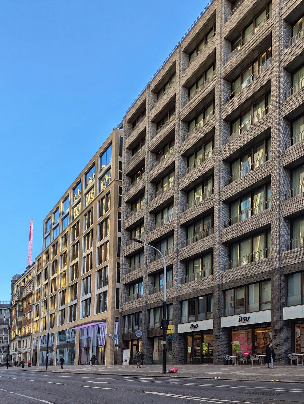
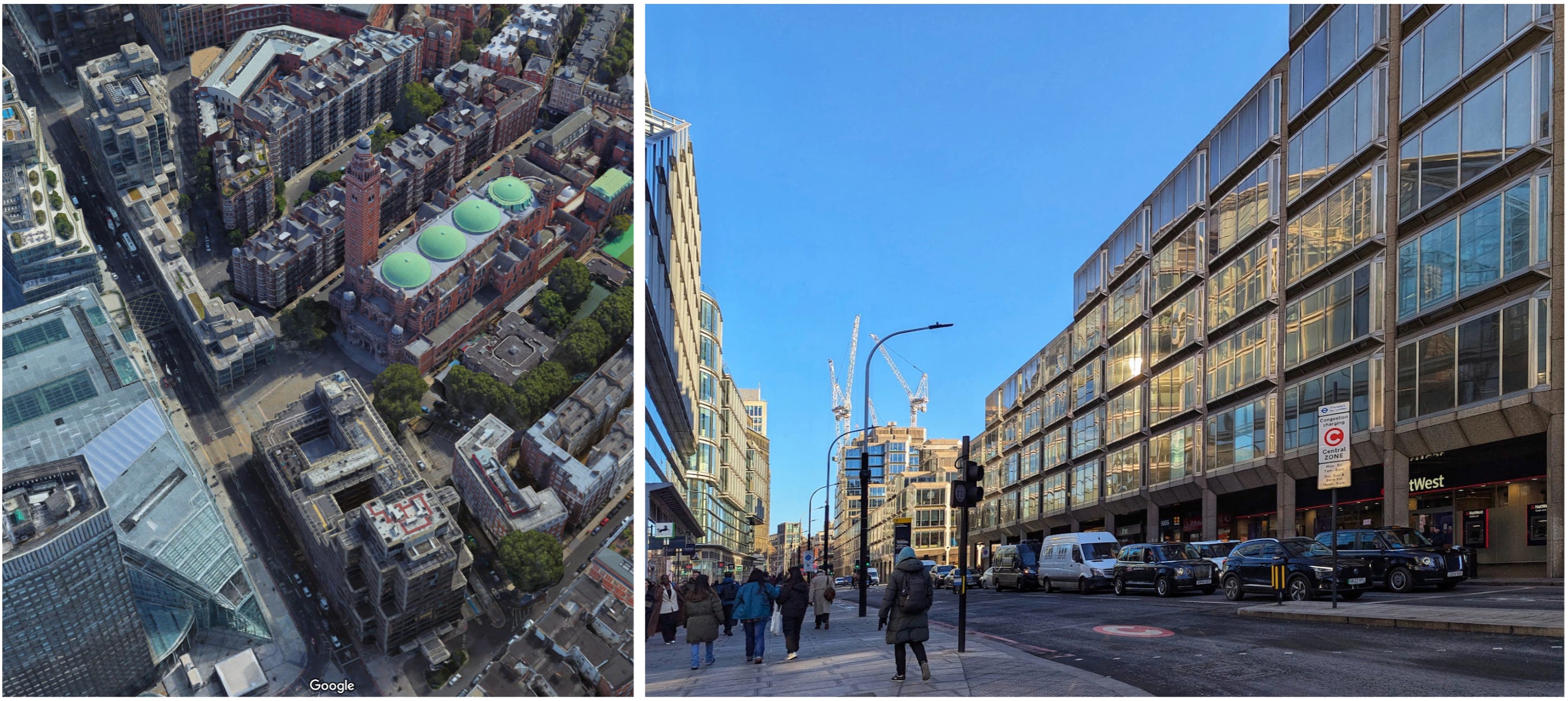
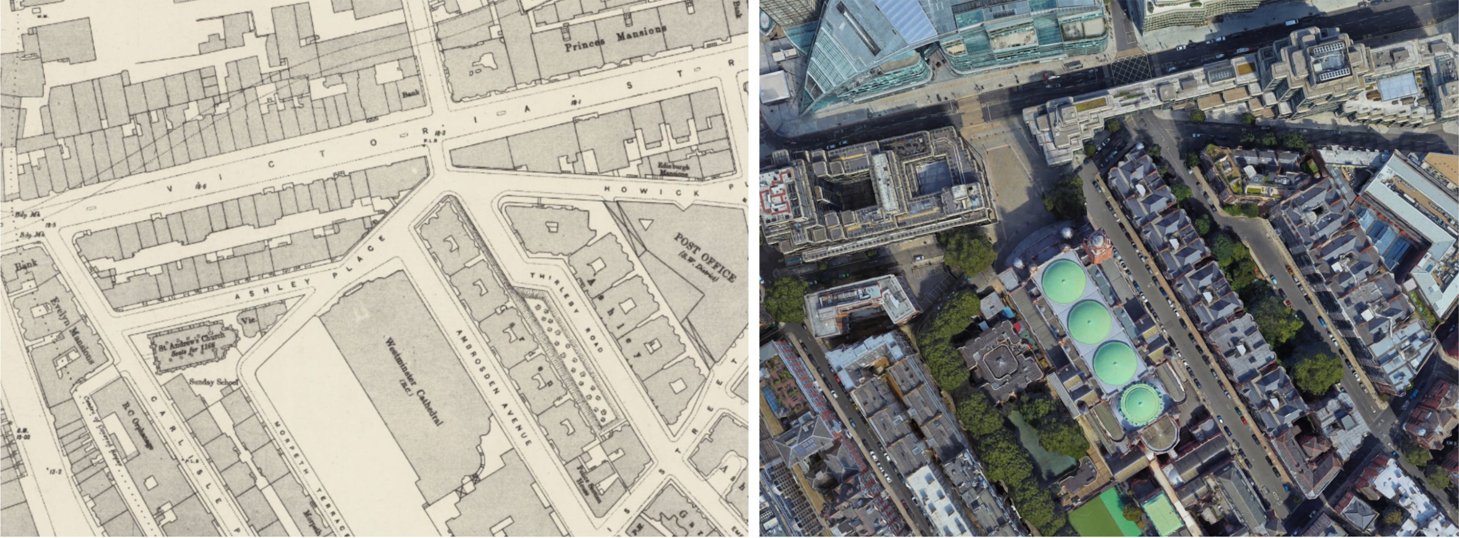
Consider Victoria Street, one of London’s forgotten road cuttings. Victoria Street is not much visited by tourists, and as we shall see, much of it is indeed very ugly. But its ugliness is varied in kind, and interspersed with remnants of former beauty and foreshadowings of future renewal. I find it extremely interesting.
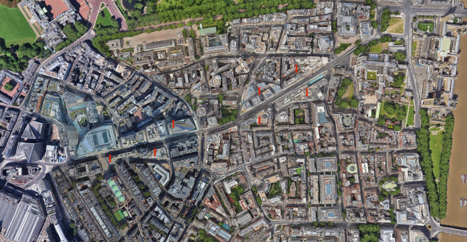
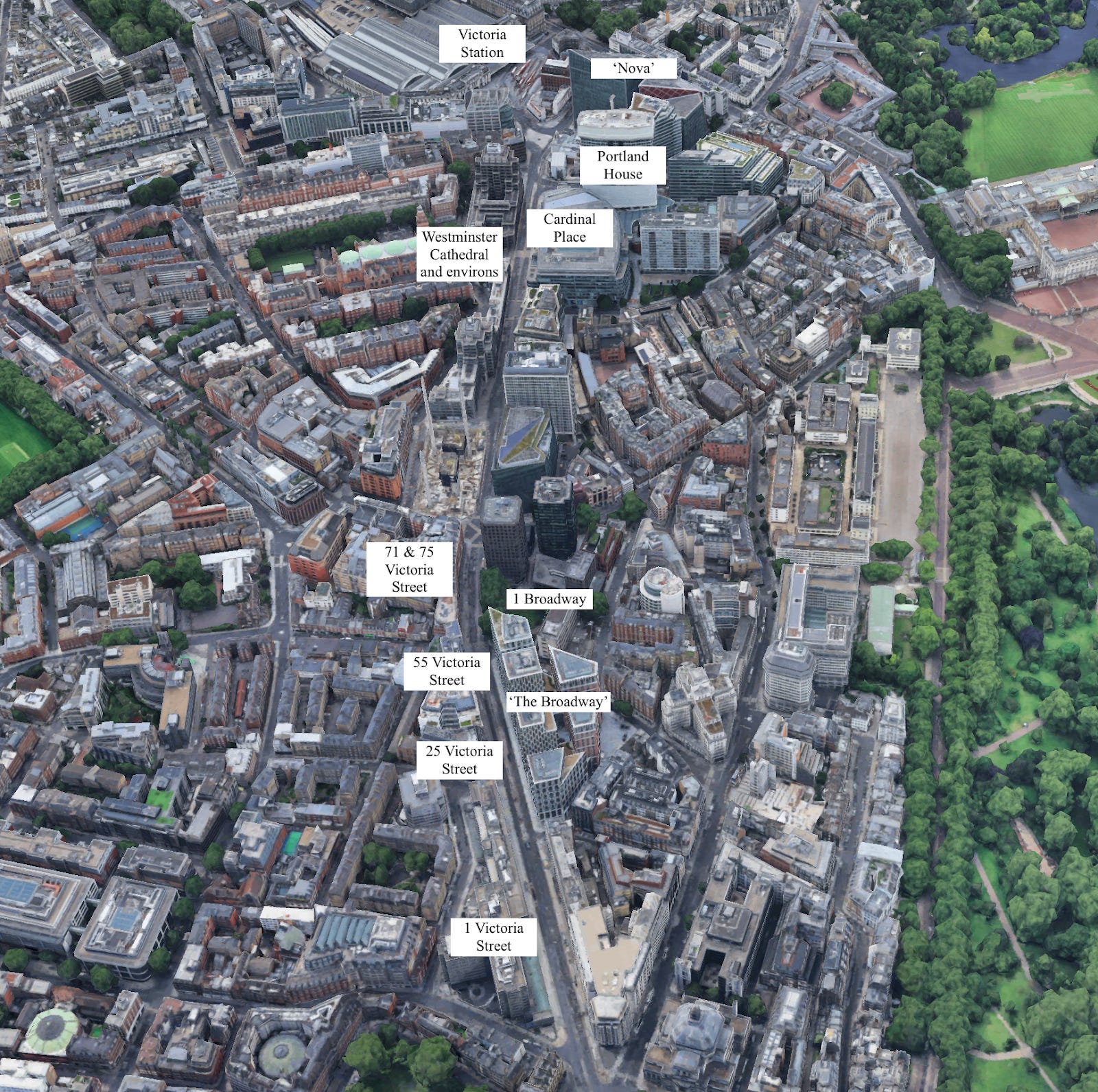
Victoria Street was cut through the fabric of Westminster in the 1840s. One of the giveaways of this is that many of the blocks around Victoria Street have strange shapes, like obtuse triangles and thin irregular polygons. I have marked these with the letter ‘I’ on the map above. Building on irregularly shaped plots tends to be more expensive, so private developers try to avoid them. But there was no way to create a straight arterial route without slicing through lots of blocks, leaving oddly shaped block segments for redevelopment.
Although Victoria Street was laid out in the nineteenth century, most of its architecture is newer. The Georgian fabric of Victoria Street was initially replaced by Victorian office and mansion blocks, which were themselves mostly replaced by office buildings in the 1960s. The products of the 1960s are currently being replaced by another generation of commercial and residential buildings. Victoria thus offers an unusually complete panorama of London’s inner-urban mid-rise architecture over the last two hundred years.
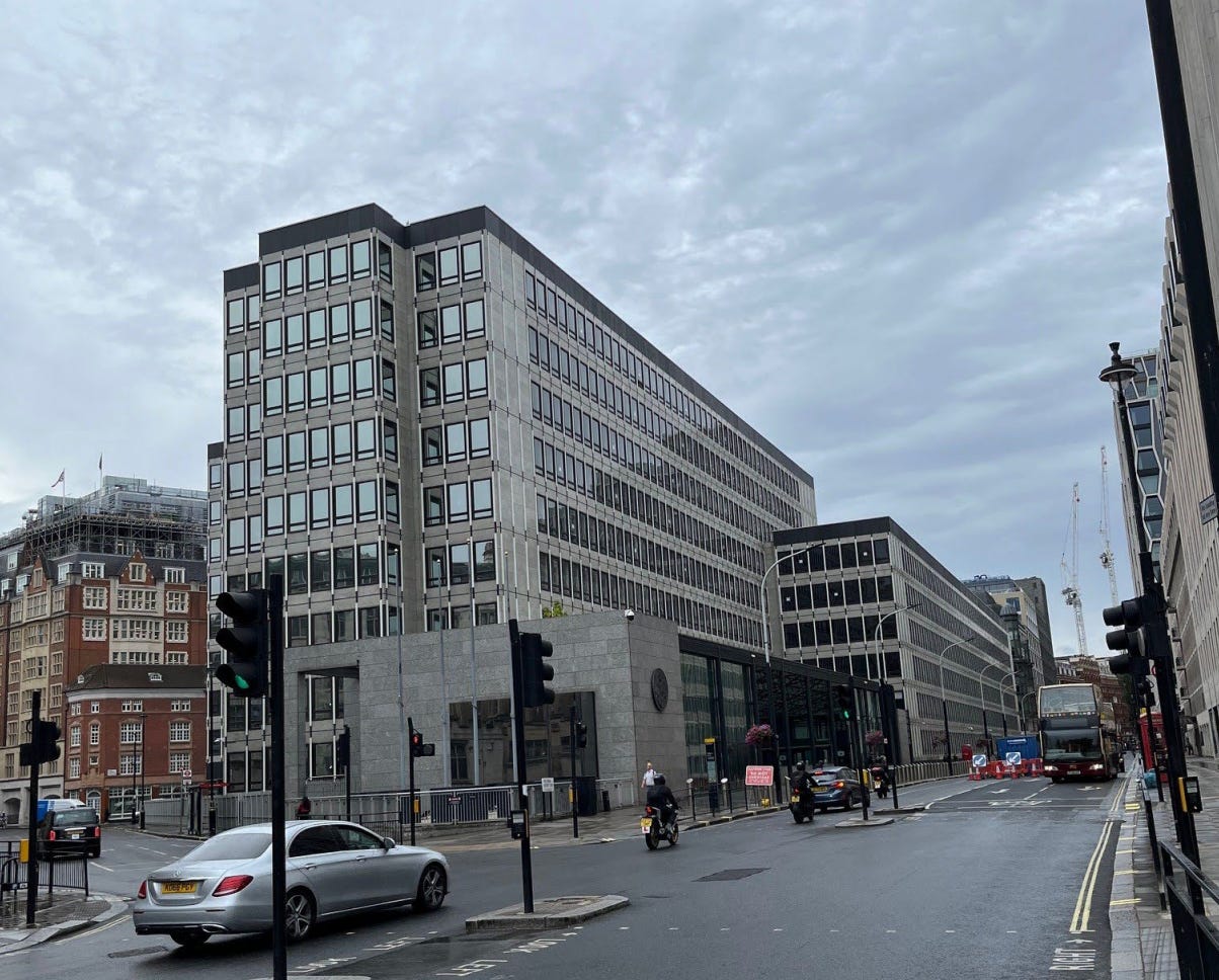
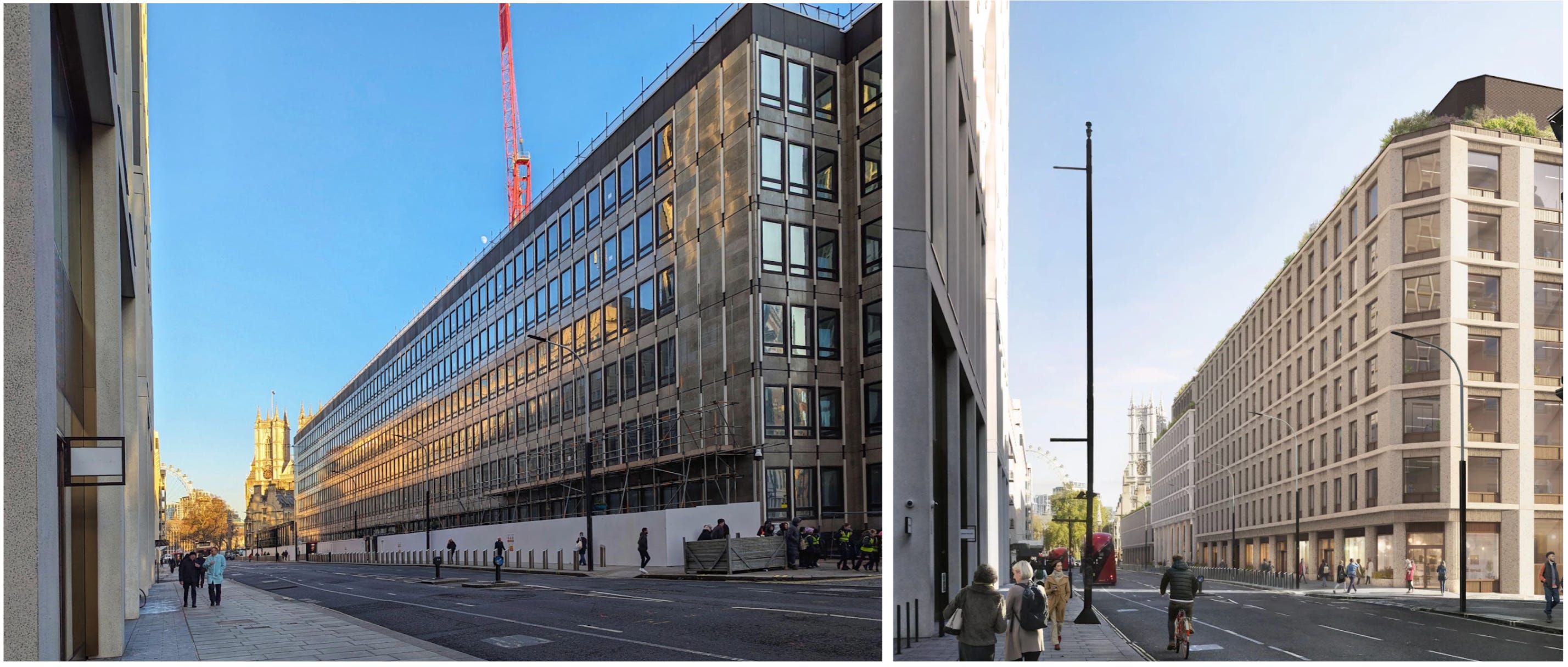
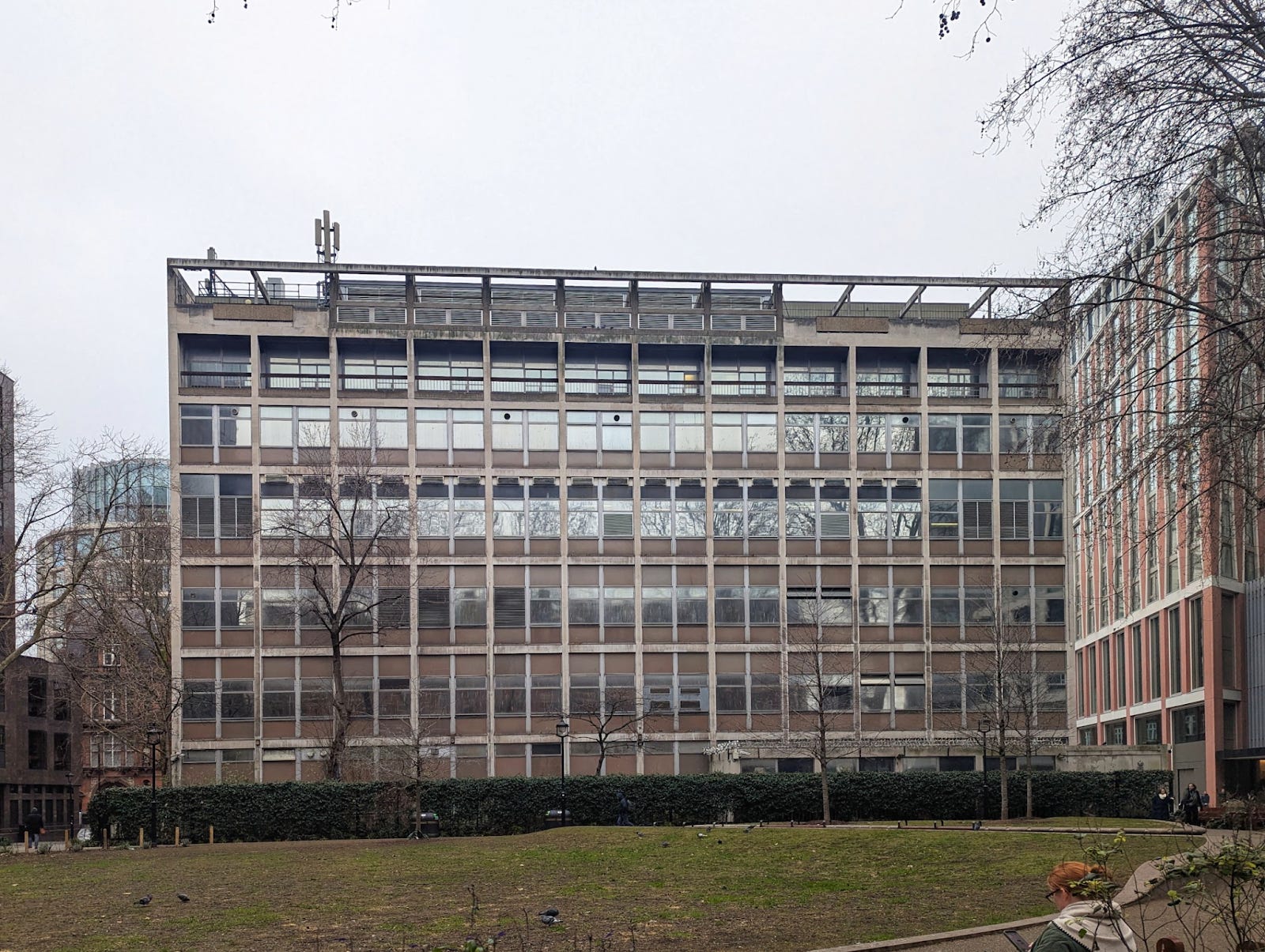
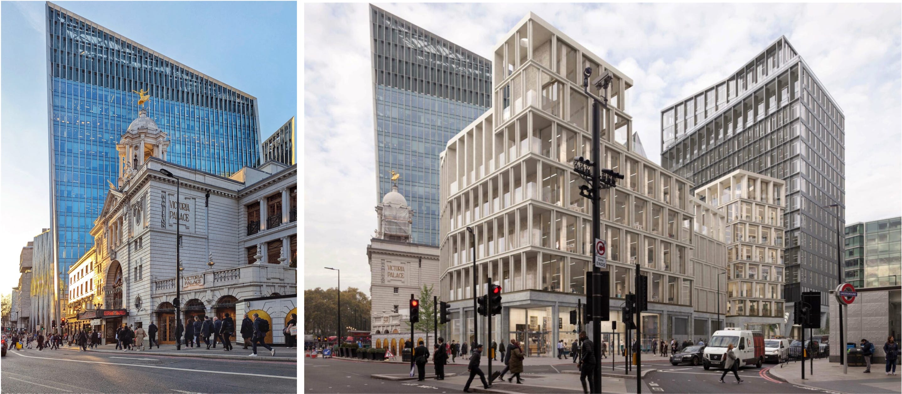
We begin at the east end of Victoria Street, leaving Parliament Square. On the left is 1 Victoria Street, a government office block that is currently disappearing under scaffolding for partial redevelopment. 1 Victoria Street reminds us of much that is bad in the architecture of the 1960s. Its problems begin with the shape of the plot, which is eccentric even by the standards of Victoria Street. This presented its designers with a challenge that they were ill-fitted to meet. Like many 1960s architects, they seem to have been incapable of planning in anything except rectangles. On an irregularly shaped plot like this, this meant they had to leave a series of dead spaces around the building in all the areas into which rectangles could not be fitted.
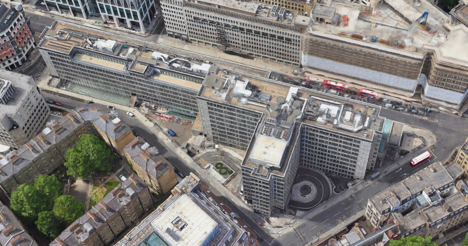
It is significant that the redevelopment of the building is going to solve this problem. In fact, the massing of the new building shows great intelligence, filling the various dead voids, adding height, but including various setbacks out of deference for the street. Various perspectives onto the building have obviously been thought through with extreme care
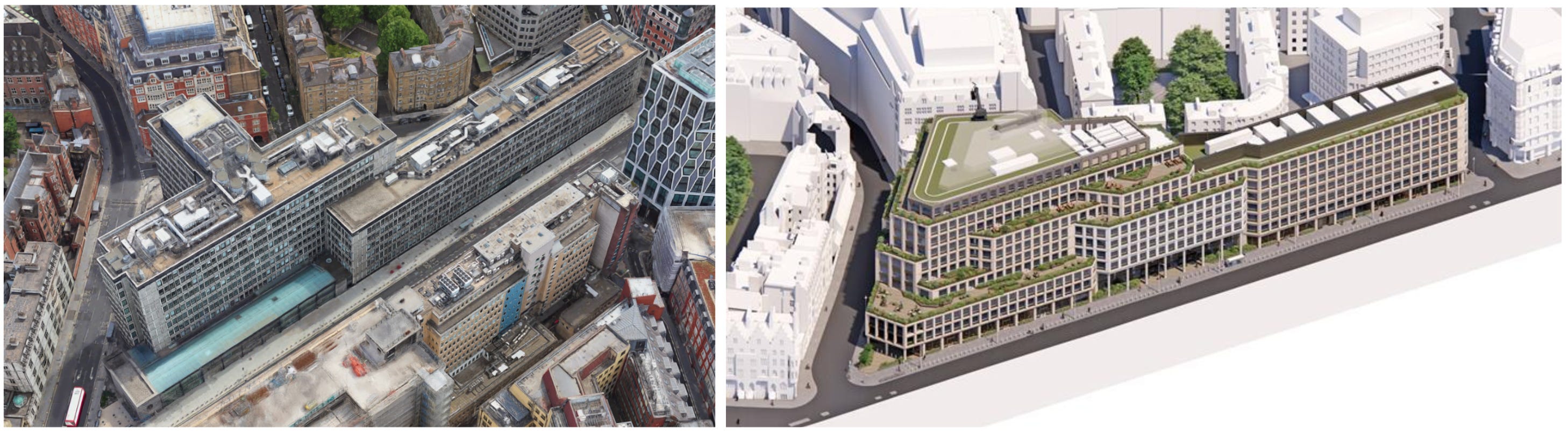
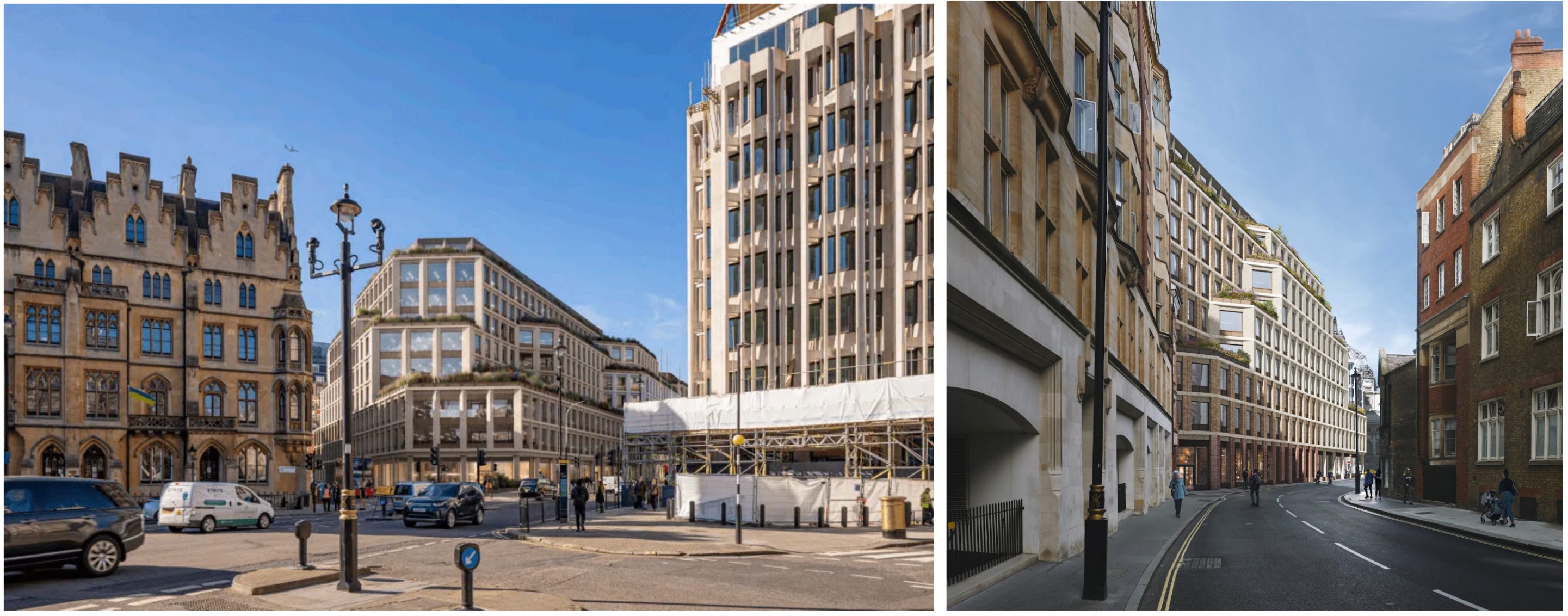
It is sad, and rather striking, that despite all this skill, the future 1 Victoria Street will not be one of the great buildings of London. Its chief problem is evident in the view along Victoria Street shown below: the architects have made almost no advance on the repetitively gridded treatment of the original facades. The facades have been broken up somewhat by the superior massing, but every available surface is still covered with an unvarying grid of windows. It is remarkable that architects who can compose a building in three dimensions with such obvious intelligence are so helpless when it comes to the much simpler task of two-dimensional composition.
Why are unrelieved grids so unpleasing? This is a question of great importance, which we cannot hope to answer here. But it is worth drawing out one point. Something you will notice about high-quality graph paper is that it includes lines of varying weights: often heaviest for the x and y axes, then typically of middling weight for every fifth line. This makes the paper more legible than if the lines were all of equal weight: it is far easier to find (27, -18) on the right graph below than the left. In architecture, of course, you are not trying to read information off a facade in any straightforward sense. But there is a sort of ‘intransitive legibility’ to a facade that is patterned at multiple levels of scale, and a sort of intransitive illegibility to an unrelieved grid. The eye finds no place of rest, no points of emphasis, no main lines from which to begin its investigation. The effect is exhausting and alienating in something like the way that studying bad graph paper is: we know at once that we are contemplating something that is indifferent to the needs of the human eye. We shall return to further illustrations of this as we go on.

The next group of buildings shows some interesting types. We have two examples of late twentieth-century ‘postmodernism’, which in this context involved attempting to recover some Victorian architectural and urbanistic forms to humanise modern building types. Both buildings are obviously aesthetically unconvincing, but it is interesting to ask why this is so. The massing and facade composition is much the same as that of many good Victorian buildings, so it cannot be these. Many postmodern buildings have obviously cheap and ugly materials, but that doesn’t seem to be the problem here either: the buildings are faced in good limestone and a tolerable red brick, not much different to their Victorian neighbours.
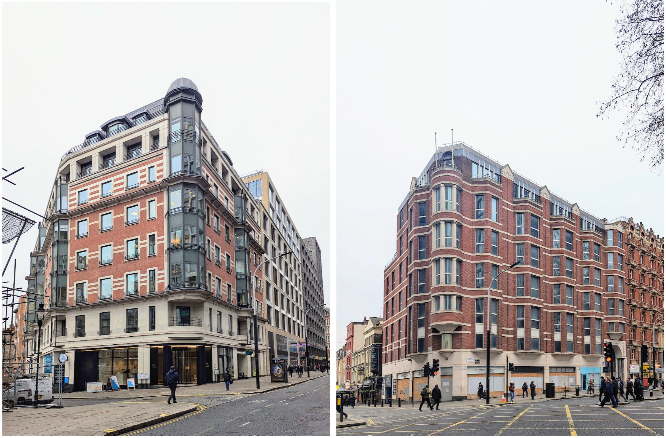
The failure, I think, is simply that they are badly detailed. This is particularly clear with 71 Victoria Street, because it stands next to and consciously tries to imitate the Victorian mansion block at No 75. Every detail of the unfortunate No 71 looks crude and shoddy by comparison, and every transition is clumsily handled. One is reminded anew of the vast loss of skills that took place between the 1940s and 1980s, such that a developer who attempted to emulate a Victorian precedent was unable to do so with even passable success. It is unsurprising to learn that No 71 is not long for this world.

With No 75, we come to the first of our Victorian survivors. After the traumas of our walk so far, one takes pleasure in several features of this building, although the Victorians would probably have thought it monotonous and commonplace. The facade is composed symmetrically around a powerful central gate, with the windows above the gate so grouped as to mark them out from the wings. Its walls have some pleasingly visible depth, giving a reassuring feeling of strength and mass. The building is also interesting as an example of Victorian urban density: eight storeys and high plot coverage have not stopped apartments in this building from being intensely sought-after.
A recent development in this part of the street that merits note is No 55. 55 Victoria Street is in some ways a remarkably good building. Like most higher-end London architecture of the last decade, it is faced with an attractive textured brick, an extraordinarily easy way to improve the appearance of a building. The interweaving of the vertical piers and the horizontal floor divisions is deftly handled and accentuated by the use of raised ornamental brickwork. Many recent London buildings project their large balconies out over the street, giving them the appearance of chests of drawers with all the shelves pulled out. But here the balconies are recessed behind the plane of the facade, revealing the depth of the building’s frame and giving the building even more obvious visual strength than No 75.
We also find reason for optimism on the north side of the road. Facing us we have a group of large buildings with an irritating facade pattern made up of elongated hexagons. This is ‘The Broadway’, finished in 2023 on the site of the enormous 1960s headquarters of the Metropolitan Police. It is easy to be snide about The Broadway, but actually it is a great improvement on its unrelentingly grim predecessor. It creates a fine perspective onto Charles Holden’s 55 Broadway, an interesting and significant building that deserves to be celebrated. It has also broken down the relentless horizontality of the building they replaced, and whatever the defects of the new facades, they are better structured and more lively than those of their predecessor. If all English architecture was improving at this rate, we would have much to look forward to.
Advancing west, we come to a small park, popular as a lunch venue for office workers. In the bushes lurks an old monster. This is 1 Broadway, one of the area’s last survivors from the 1960s. Let us hope it is demolished before it attracts conservationist attention.
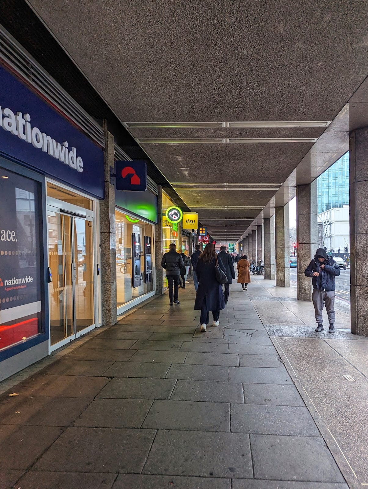
Beyond this is the extremely interesting group of buildings surrounding Westminster Cathedral. Facing the street are two long mid-rise blocks from the 1970s. It must be admitted that they are massed with great sensitivity, rising up where the plot is deeper, falling where it is shallowest, filling the plots like natural landforms rising from the sea. In this respect they are an almost perfect contrast to the inept rectangles of 1 Victoria Street discussed earlier. They also define a square in front of the Cathedral and frame a view onto the Cathedral from Victoria Street, a well-intentioned decision to which we return below. Nonetheless, it is beyond argument that these are exceptionally ugly buildings, with their nasty flimsy-looking materials and hideous windows, canted out like metallic insect eyes. Unfortunately, one of them is currently being refurbished. An excellent opportunity for demolition has been lost, and we shall probably now be stuck with it for some time.
Both buildings are extended over the pavement, creating a colonnade. Pavement colonnades are a highly efficient urban form and can also be an appealing one, even at a gloomy latitude like England’s: this is proven by the colonnade at Covent Garden, which is widely admired. But they need to be very high-ceilinged and faced in a pale, handsome material; it also helps if they are oriented toward the south so that they catch direct sunlight. None of these things is true of the Victoria Street colonnades, which are dismal and oppressive places. This is the sort of architectural failure that gives urban density a bad name.
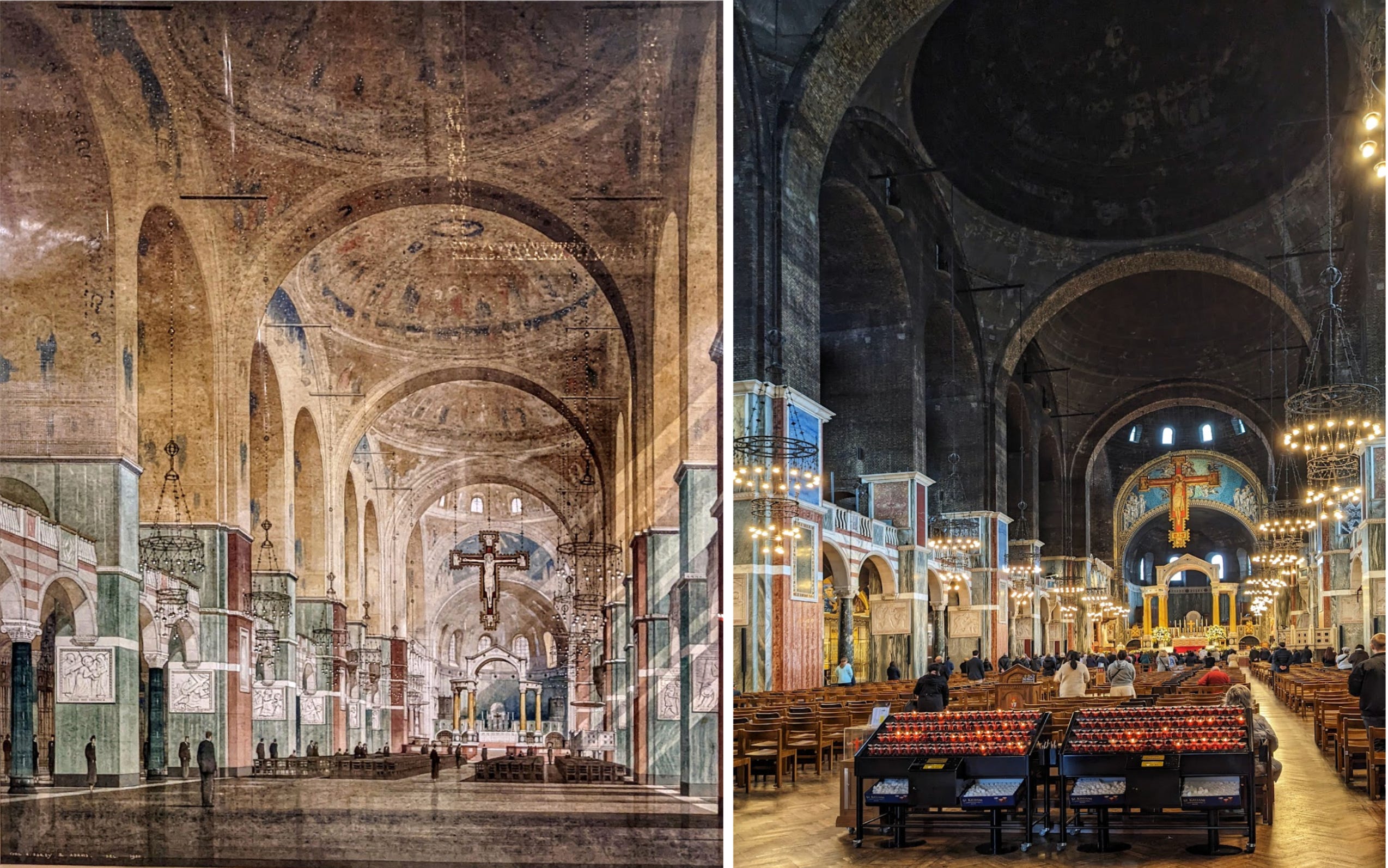
Set back from Victoria Street behind a small square, we come to Westminster Cathedral, England’s premier Roman Catholic church. I am an Anglican, and like most English Christians I am not untouched by the base spirit of denominational competitiveness. So it is with some reluctance that I say that this is a great building, though a strange one, and that it deserves far wider appreciation than it generally receives. It is also undeniable that it is one of maybe ten or fifteen buildings in this city with a really tangible sense of holiness. Even people with little religious or architectural sensibility tend to lower their voices when they enter, sensing at once that this is a place where common chatter is unfitting. Far fewer have this reaction upon entering Westminster Abbey or St Paul’s, masterpieces though they are in their own ways. Few tourists visit Westminster Cathedral, but they should, ideally clearing time for it by skipping the inexplicably common pilgrimage to Leicester Square.
Westminster Cathedral has a curious design history. Having resolved to build a national cathedral at Westminster, the English Catholics spent many years pondering what its design should be. At one stage they made the surprising decision to commission an exact copy of a recently finished building in Vienna, the Votive Church of Heinrich von Herstel. They applied to von Herstel, who was apparently flattered and professed himself willing to oblige. The Votive Church is a very fine building, which would have done the English Catholics no discredit. But the plan was frustrated by the sudden death of von Herstel.
After renewed debate, the diocese turned to the English architect Francis Bentley, who designed today’s cathedral in a style that is usually called Neo-Byzantine. The interior of the building was to be expensively faced in gold mosaics, but funds ran out when the work was only partly done, leaving the raw black engineering brick of the domes exposed. The result violates the standard rule in architecture according to which buildings should become lighter and more refined as they rise. I like architectural rules and I think they are often useful. But I cannot deny the mysterious power of Westminster’s strange dark domes, hanging over the luminous gold and marble below.
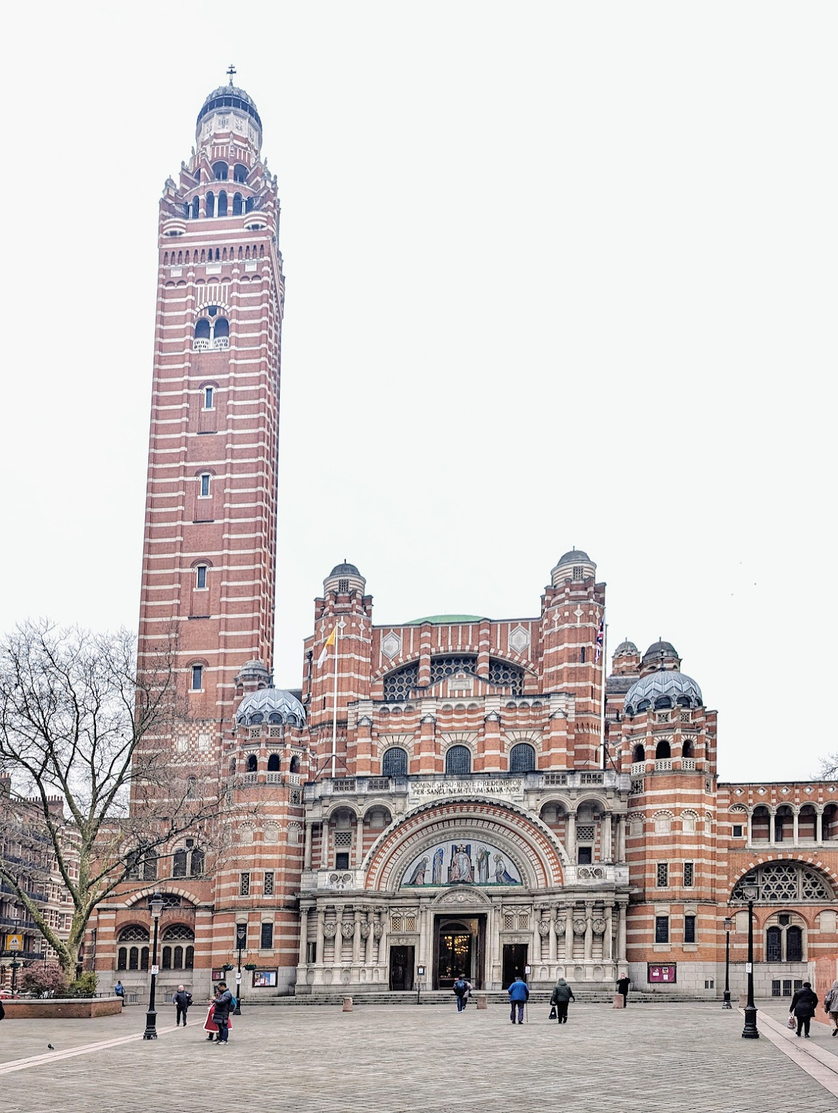
Externally, Westminster Cathedral is a more ambiguous success. Originally there was almost no open space in front of it: unusually for a great public building, it opened onto a narrow side street. The planners who later cut a deep plaza from the cathedral to Victoria Street undoubtedly did so in a spirit of respect. But their gesture may have been misplaced. Viewed from a distance, the Cathedral looks a little squat and formless, with elements crowded together and piled wantonly on top of one another. Still today, the best way to approach it is not frontally from Victoria Street, but coming suddenly up in front of it from Thirleby Road or Howick Place. The facade cannot be seen as a whole from this distance, so it does not seem low or cluttered: instead, one is struck by the concentrated power, strangeness and ingenuity of Bentley’s detailing.
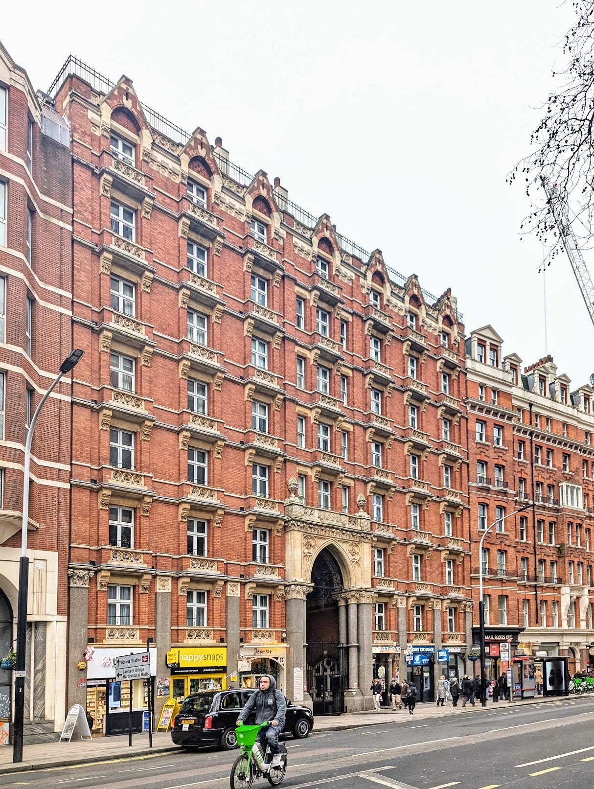
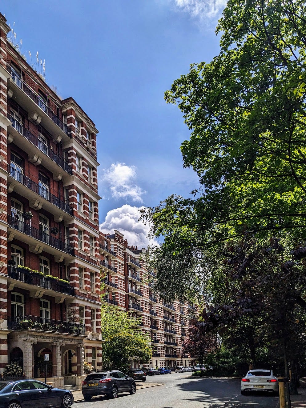
Westminster Cathedral is surrounded by one of London’s more celebrated groups of ‘mansion blocks’, a term devised by the Victorian real estate industry to dignify blocks of flats. They follow a simple design, with eight undifferentiated storeys stacked on top of each other. Nineteenth-century architects tended to regard designs like this as monotonous, subscribing as they did to the doctrine that a building should appear as an organic unity, from which no part could be subtracted without damaging the unity of the whole. But the bar has fallen so much that it is difficult to care, and these blocks now seem like magnificent examples of dense residential architecture, cheerfully enlivened by their bay windows and fine balconies. The horizontal banding of the masonry pleasingly echoes that of the cathedral, tying the great sacred building back into the vernacular fabric around it.
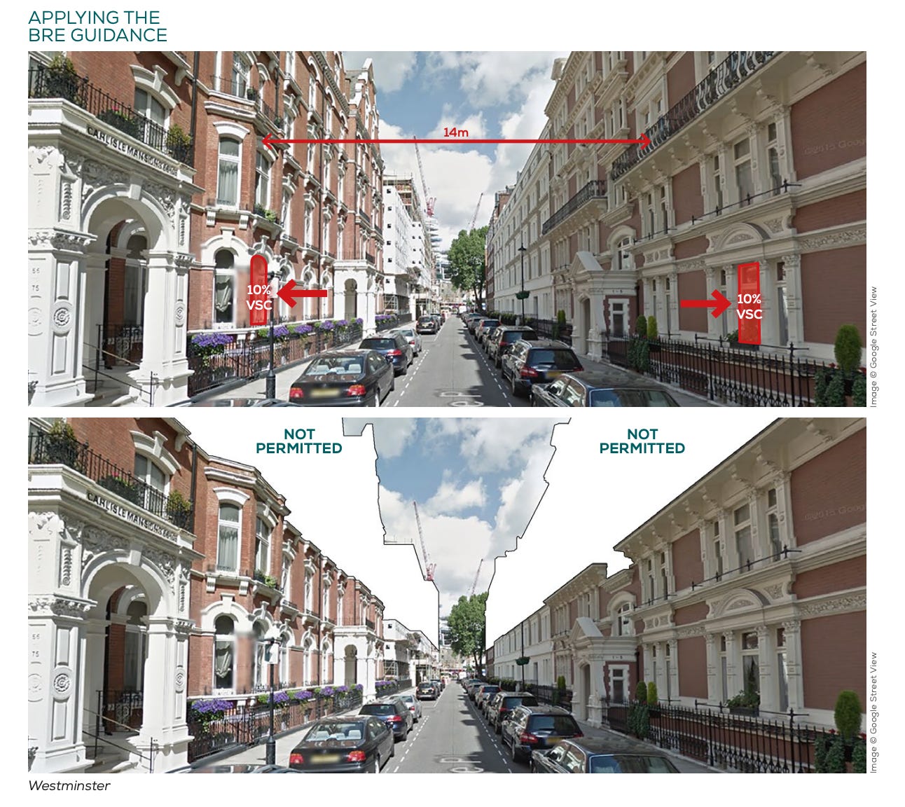
People often ask why we no longer usually build such attractive vernacular buildings today. This is a question of great difficulty, and I do not think I know the whole answer (though I have written about it here and here). But the Victoria mansion blocks do illustrate one reason, namely that some features of traditional urban form tend to contradict modern approaches to town planning. In 2017 the little-known think tank London First published an excellent report showing how the daylight and sunlight guidance of the Building Research Establishment (BRE) would require the removal of more than half of the floorspace of Carlisle Place, the next street along from the Cathedral. The BRE compassionately wishes to protect people from living in gloomy slums, but given that people are prepared to pay over £1,000 for each square foot of Carlisle Place floorspace, one rather thinks this compassion has been misplaced.
Walking on from the Cathedral, we enter a disaster zone, a place of confusion and overwhelming ugliness. In part, this is probably inevitable: a huge bus station, a huge coach station, huge numbers of pedestrians, and a huge quantity of arterial traffic compete for limited road space, and one can only sympathise with the planners who must mediate between them. But there can be no excuse for the arrogant and foolish buildings that rise over the chaos below. There is Cardinal Place, designed to look like a giant spring that has been tied back to Cardinal Square, a great postmodern trebuchet about to discharge its load far over the city. Next along is Portland House, an ultra-grim modernist slab block whose ugliness is being only slightly mitigated by ongoing refurbishment. Then there is Nova South with its gaping planes of red glass, as though an understandably vengeful god had slashed it open to reveal the building’s flesh beneath.
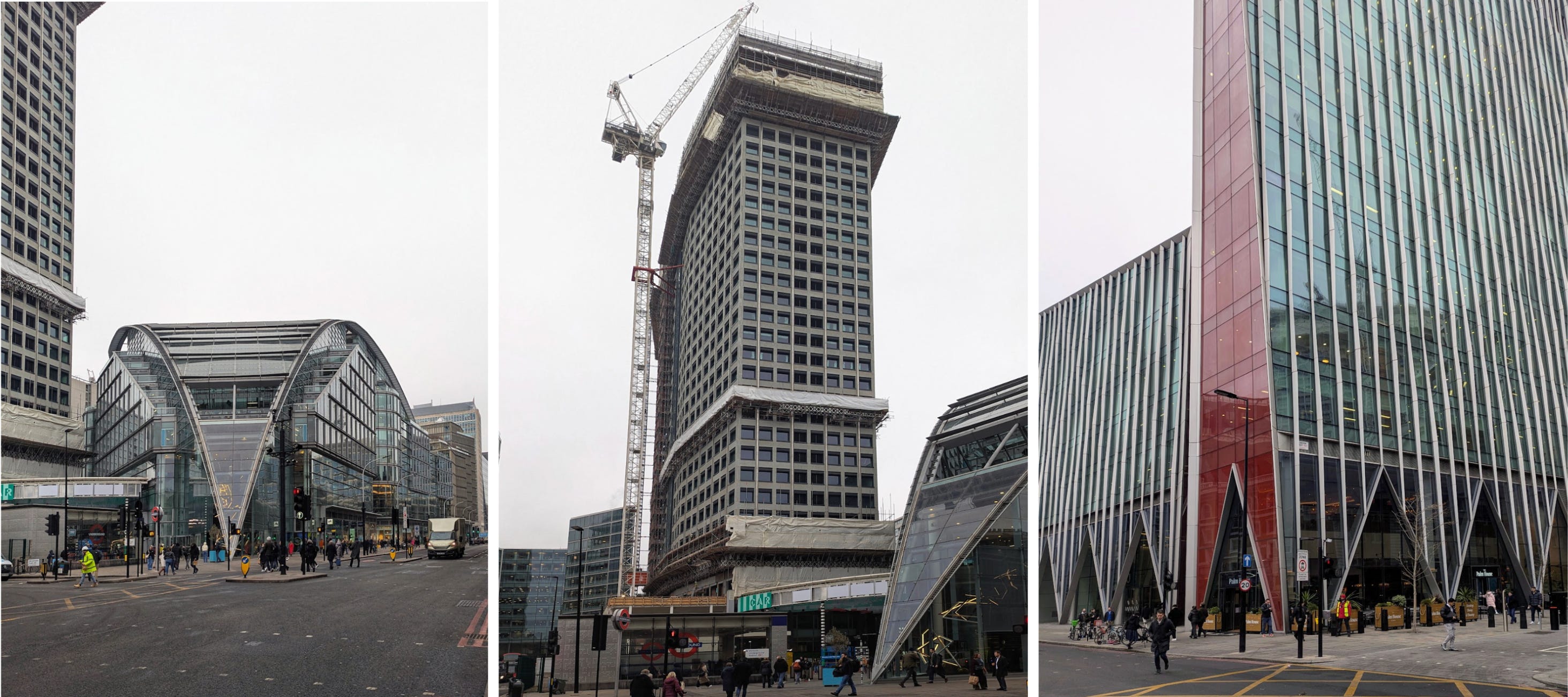
There are only a few points of comfort to be found in this area. One is Victoria Palace Theatre, by the prolific Edwardian theatre architect Frank Matcham, a tasteless but amiable design whose charms are enormously flattered by the bleakness of its surroundings. Perhaps there is also some comfort to be found in the new commercial buildings rising around it. Critics will see nothing here but more flavorless modern offices. But at least these buildings are sensitively massed, appearing as a sociable urban group rather than a monster-block; they use quiet tasteful materials and mild colors, and abstain from vulgar jokes and architectural chest-thumping. They give renewed hope that London’s commercial architecture is moving in a more civilized direction.
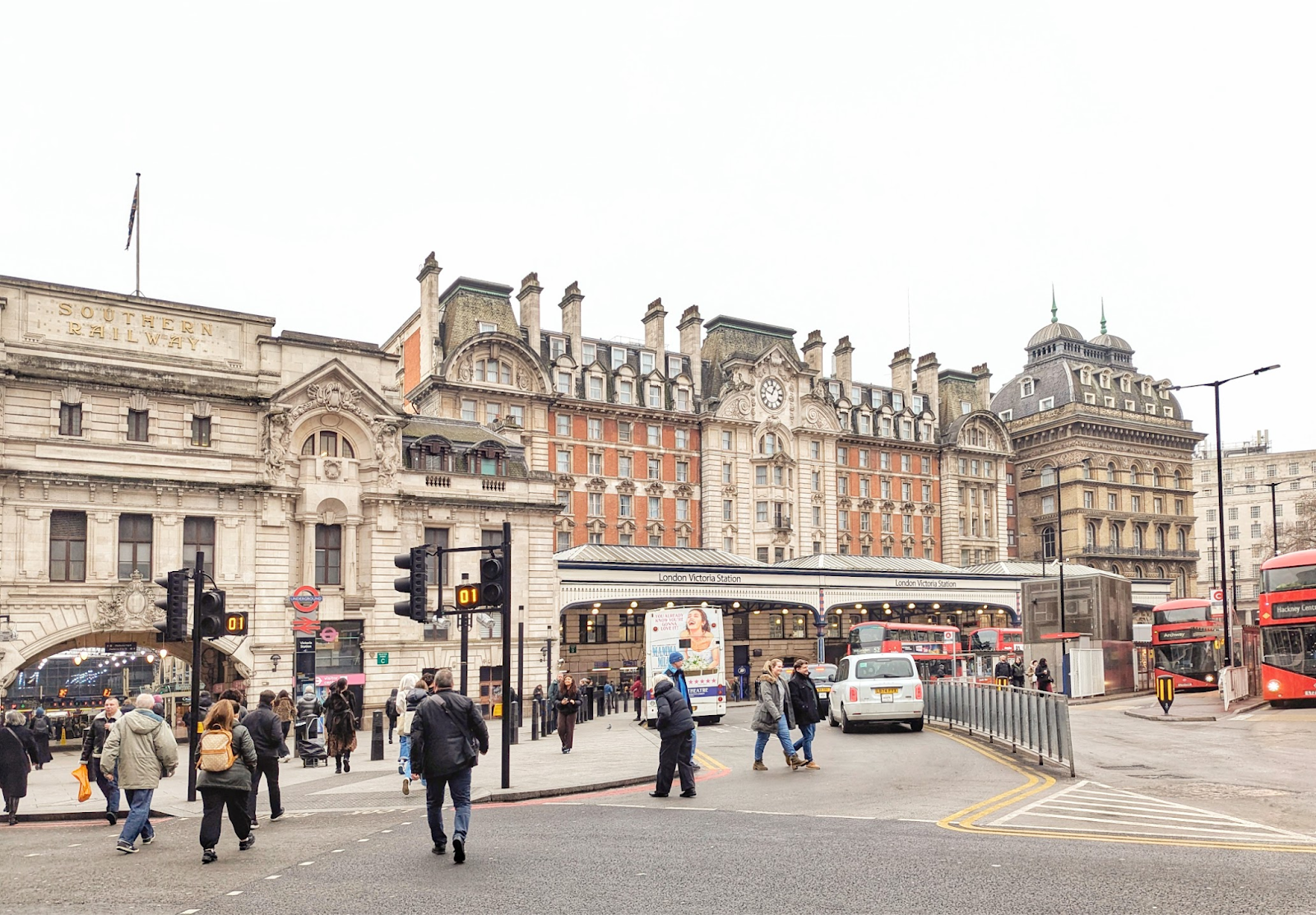
At last, we reach Victoria Station. Victoria Station is scarcely one of the beauties of London, and it has not yet received the sympathetic renovation that has so enlivened King’s Cross, Paddington and St Pancras, though one gathers that such a restoration is on the cards. For many years there were in fact two adjacent stations here, owned by different companies, one terminating the railway to Chatham, the other to Brighton. This division is still visible architecturally from Terminus Place: to the left is the handsome but lopsided facade of the Kent station, in an Edwardian mannerist style; recessed and to the right is the huge, heavy front of the Brighton station, dating from the same decade but in a French Renaissance style, with its lower storeys obscured by a projecting canopy. Finally there is the station hotel, with the square dome and arched windows: this is actually forty years older than the rest of the station complex, a survivor of the original station buildings from the 1860s.
This building was designed by the railway company’s engineer, one Charles Morgan. It is a kind of slab block, nineteen windows wide and nine storeys high. In respect of its underlying volume it is thus similar to the various modern blocks we have examined, somewhere between 1 Broadway and Nova South in size. Its effect is however obviously quite different. Morgan visually structured the facade into three slightly projecting stone ‘pavilions’ and two slightly recessed brick ‘wings’, intersecting with a vertical division into a three-storey stone base (behind the canopy), a central group of four brick storeys, and two storeys in the roof. The underlying grid of 160-odd windows is thus structured into a higher-scale pattern of fifteen facade units, giving it a sort of visual legibility analogous to that of the superior graph paper discussed above.
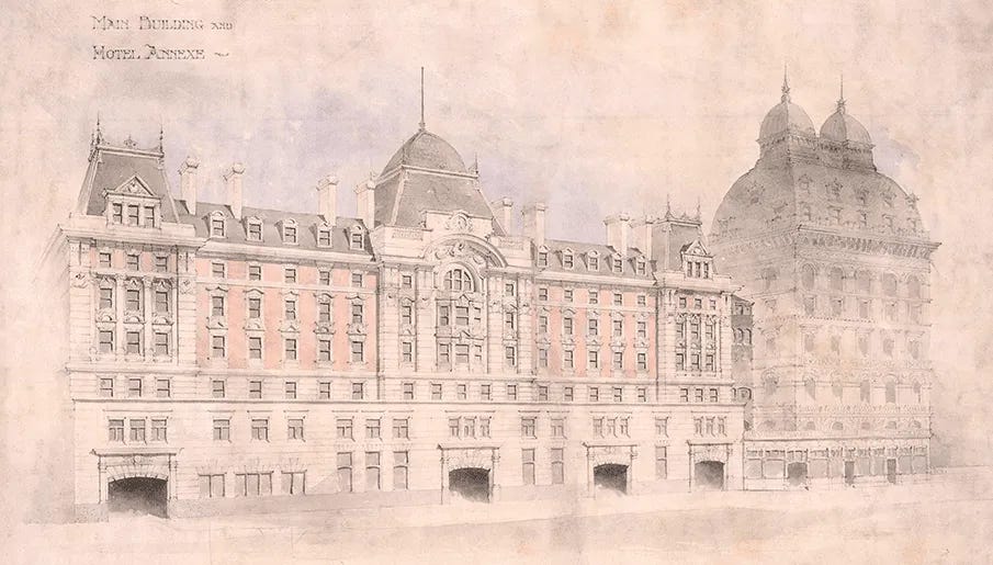
None of this required any great ingenuity from Morgan. ‘Five-part composition’ into pavilions and wings had been a standard way in which architects across Eurasia humanized big bulky facades for thousands of years, and the ‘tripartite’ vertical division into base, principal area, and crown was used for virtually every institutional block in nineteenth-century Europe. A hostile viewer might still find this building grimy, heavy and cluttered. But Morgan’s compositional rules have done their work, and it is undeniable that it has a rough-and-ready visual coherence that the later slab blocks of Victoria lack.
What have we learnt on our walk? The standard narrative that British architecture had a precipitous visual decline in the twentieth century is, as usual, vindicated. But we have also seen signs of recovery. The architecture of the last ten years shows inconsistent but sometimes striking improvement in respect of planning and massing, and some more tentative improvement in respect of materials and detailing. Perhaps we may live to see someone try a five-part composition.
Samuel has previously written The beauty of concrete, Making architecture easy, Against the survival of the prettiest, and In praise of pastiche for Works in Progress.
 | A guest post by
|